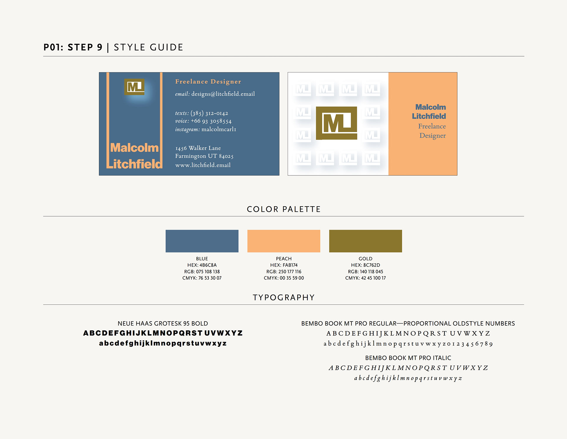
The project was to create a business card that relied exclusively on type for identification using exactly 3 inks/colors. I loved working with Neue Haas Grotesk to come up with a logo with my initials. The color choices were for readability and so the back and front would complement without copying each other. By extending the ascenders of the first and last letter of my last name, I was able to create a better grid for the overall presentation while giving lots of breathing room for the logo itself (highlighted with a white shadow). The tone-on-tone logos on the back use the same blue as the front for the shadow, giving a slightly softer feel than if I used the standard black shadow.
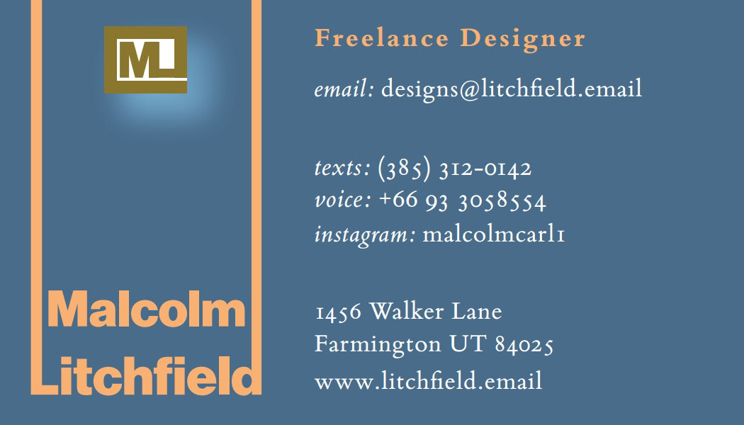

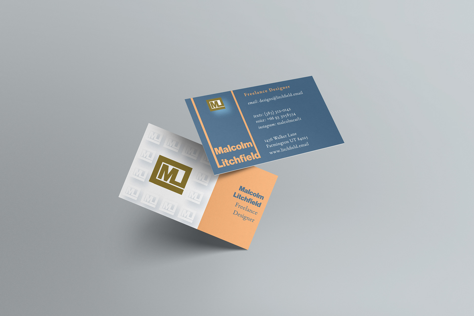
I think my biggest challenge was the length of my name! Finding a way to make that prominent while giving room for the rest of the information was a challenge. Fortunately Bembo Book has a narrow letter width, so it was easier to add readable contact information without taking up a lot of room. I also think using old-style numbers gives the card a bit more class and "bookish" elegance.