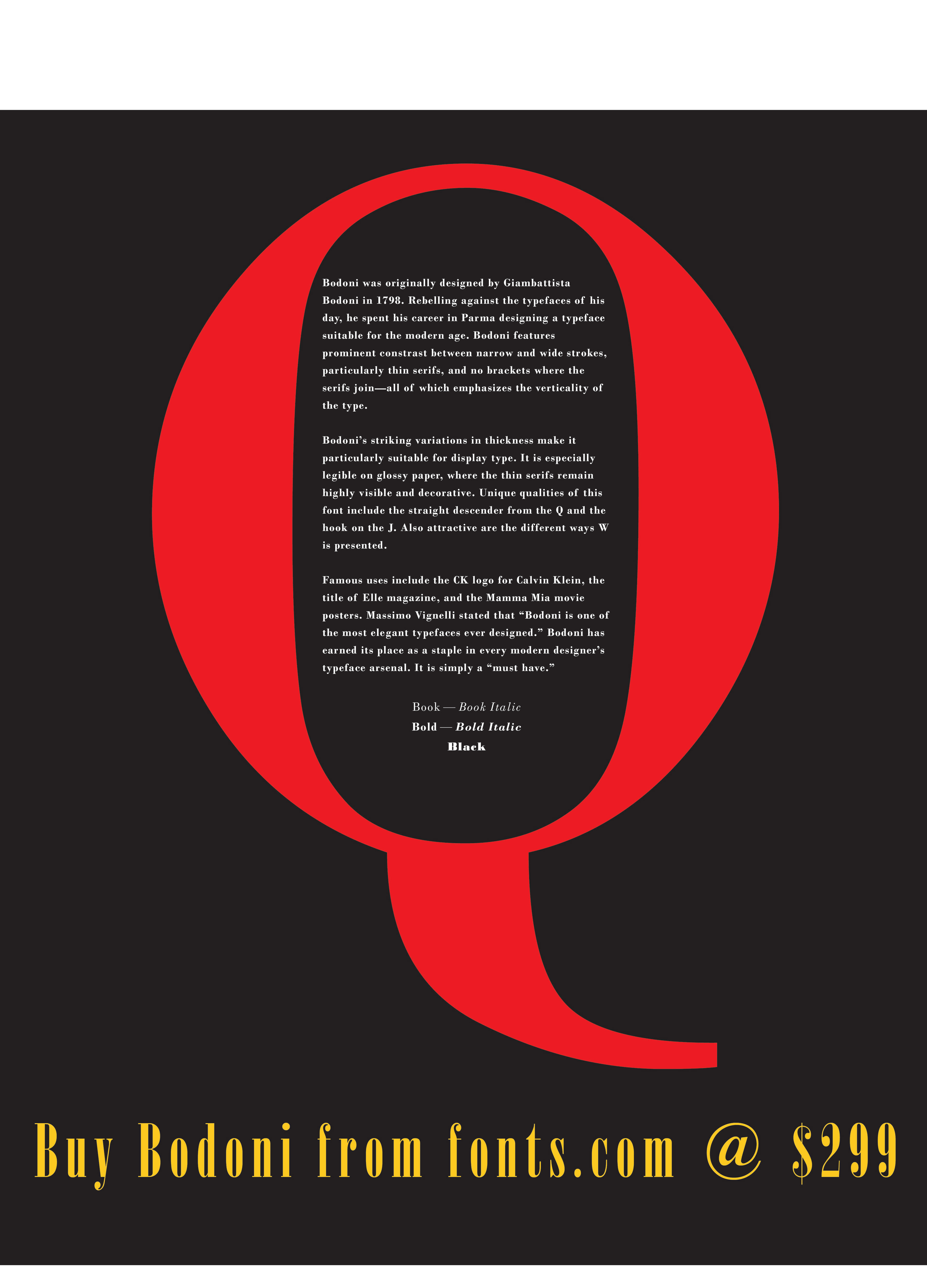
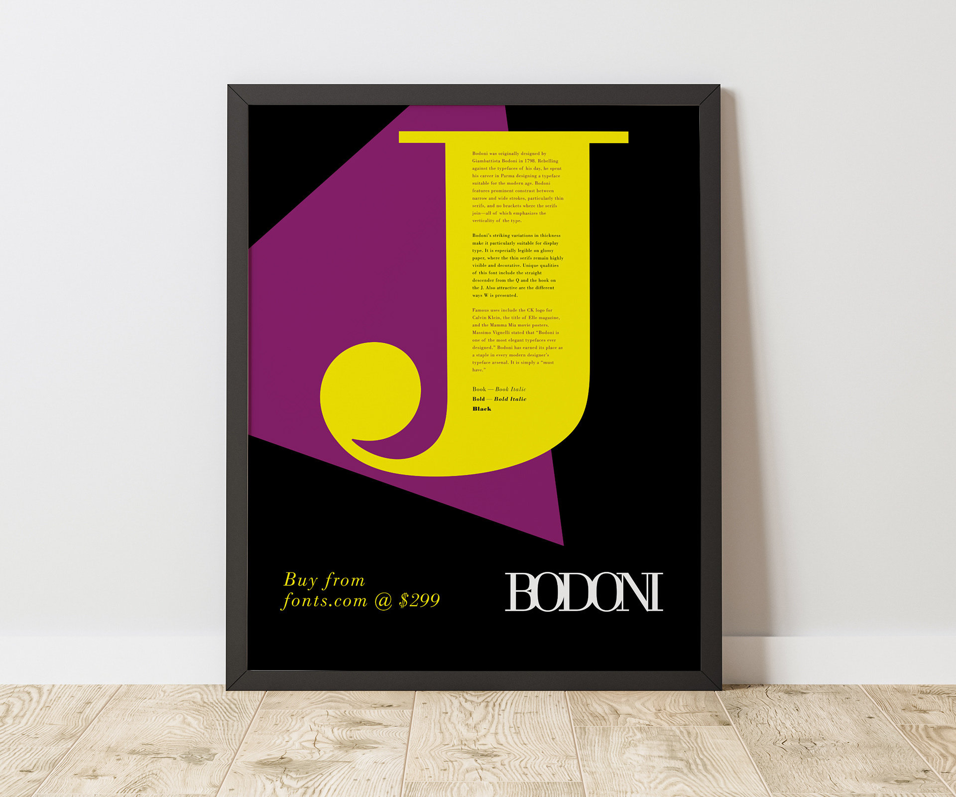
The project was to design a poster illustrating the benefits of using one typeface, in this case, Bodoni. The fonts in this typeface family are great display fonts with a particularly unique hook on the "J," so I used that as the focus of the poster. I also created a wordmark for the typeface name itself, which I think shows off how versatile this typeface can be.
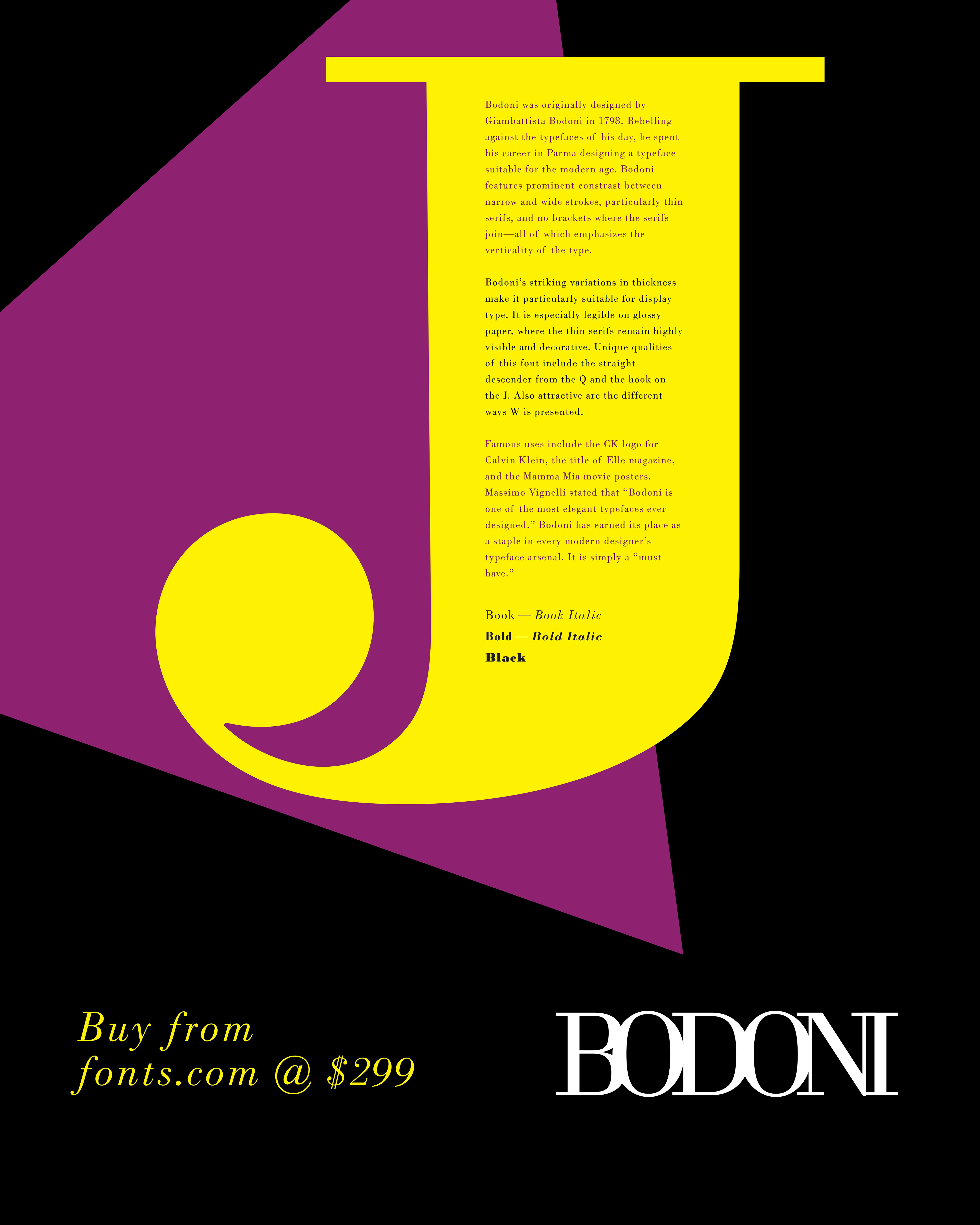
The "Q" is also quite unique in Bodoni. Here is my favorite alternative poster that I ultimately rejected in favor of the poster design above.